
Recently, the 2010 global temperature and satellite sea level data have become available. We use this opportunity for an update of the graphs shown in Rahmstorf et al. (Science 2007). Please contact us if you need those in high resolution.
Global Temperature
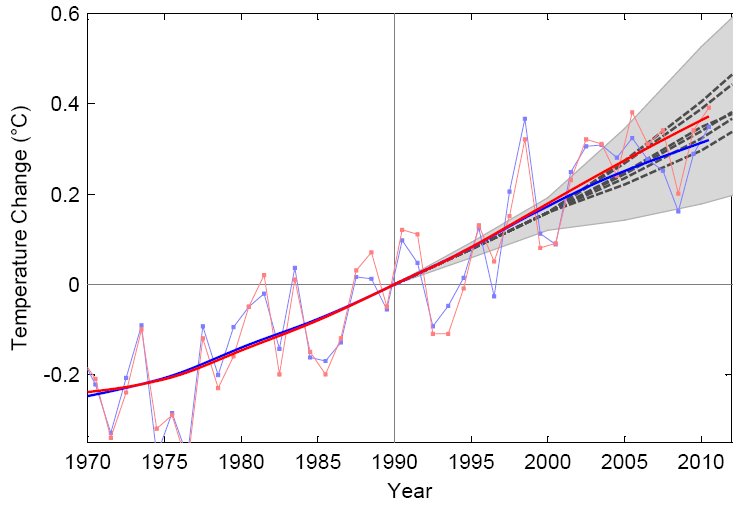
Fig. 1 Annual global temperatures from NASA GISS (red) and Hadley Centre (blue) up to 2010, compared to the temperature projections of the IPCC TAR (grey dashed lines and grey range, as shown Figure 5d of the TAR Summary for Policy Makers).
Note that the smoothing has been changed from m=11 years to m=15 years compared to our 2007 publication in order to obtain an approximately linear trend line from 1990, the start year of the TAR projections. This is required because only the magnitude of the linear trend can be meaningfully compared for such a short time series in the presence of substantial inter-annual variability. Another reason for filtering out the effects of intrinsic climate variability for this comparison is that the TAR projections (being derived from a simple model) do not include any intrinsic variability but only long-term climate trends. The longer time scale of the smooth line makes sure that the relatively cool temperatures of 2008 bring down the entire trend line after 1990, rather than just bending down the end of it.
Temperature trends are now near the centre of the TAR projections, with linear trends of 0.19 and 0.17 +/- 0.08 ºC per decade in the GISS and Hadley data, as compared to projected linear trends ranging from 0.15 to 0.20 ºC per decade in the TAR projections (depending on emissions scenario). In our 2007 paper we found trends in the upper part of the TAR range (both GISS and Hadley give 0.22 ºC per decade linear trends for 1990-2006) and proposed that "the first candidate reason for this is intrinsic variability in the climate system". This view is supported by the fact that the recent cooler years have brought the trends down to the central projection again.
Global Sea Level
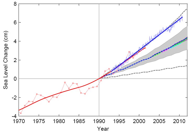
Fig. 2 Global sea level from tide gauges (red) and satellite altimeter data (blue, with linear trend line). Here only the satellite data have been updated to October 2010 as compared to our original paper (thanks to Anny Cazenave for those data), as we don't have an update of the tide gauge data. The linear trend over the full satellite data set is now 3.3 mm per year, as compared to the best estimate from the TAR (central dashed lines) of 1.9 mm per year for the same period. Sea level thus continues to rise faster than expected in the TAR, which was the key conclusion of our paper (see its final sentence).
Questions and Answers (unchanged from March 2009)
We are humbled by the huge interest our little paper has generated - to our surprise, according to the Web of Science it is amongst the 30 most-cited (out of 11,100) papers of 2007 for the key word climate (as of March 2009). Here we try to answer some of the questions frequently asked about our paper.
Why don't you use projections of the 4th IPCC assessment report in the comparison?
As you can see in our paper (look at the bottom) it was submitted in October 2006, well before the AR4 was published in 2007, so for this reason alone we could not use any AR4 data in our publication. As the 4th Assessment was being prepared, we became interested in how the projections of the previous, 3rd Assessment (TAR) had held up. One needs enough data for a meaningful trend comparison, and since the TAR projections start in 1990 there were 16 years of data available - which we considered just enough. The AR4 projections start in 2000, so we will have to wait some more years before we can tell how well they have fared.
Why do you not simply use linear trend lines?
In fact we had also tried that and found no significant difference. This still holds for the data up to 2008 as well, see Fig. 3 below. The observed linear trends are very slightly steeper than the nonlinear trend lines after 1990. Linear trends are appropriate for the time period after 1990 where the data are described well by a linear trend plus interannual noise (that's why we show a linear trend for the satellite sea level in our paper), but they don't capture the longer-term climate evolution very well, e.g. the nearly flat temperatures up to 1980. In order to show both this longer-term evolution and the quasi-linear trends after 1990, we selected filter parameters that satisfy both requirements. For those interested in the details the filter software (in matlab code) is freely distributed by its authors, Moore et al., as cited in our paper. Since we mainly use it here to estimate post-1990 linear trends, any other filter with this capability would have done just as well - or indeed simple linear trend lines. Both approaches have their pros and cons, but these are of little consequence given the results are the same (Fig. 3).
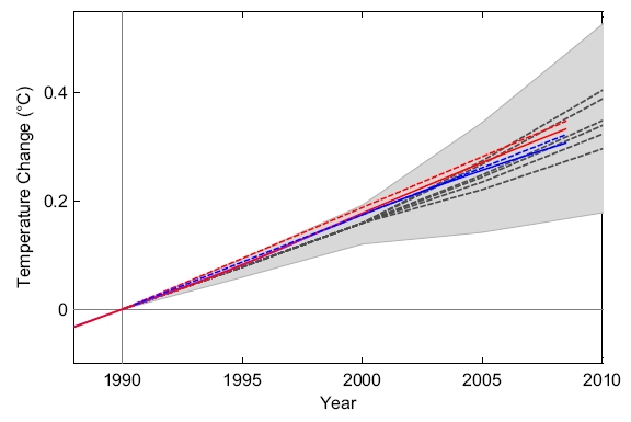
Fig. 3 Non-linear trend lines as shown in Fig. 1 (solid red and blue) as compared to the linear trends of the data for 1990-2008 (dashed red and blue).
Do you hinge your comparison on a single year 1990?
No. It is not a good idea to hinge a comparison on a single year: Due to interannual variability, you'd get a rather different result depending on whether you chose a couple of years later or earlier, so this would not be robust. We therefore pin the smooth trends together in 1990, not the annual values. The smoothed data value in 1990 is a weighted average of (2m-1) points (i.e., 29 data years) and is thus robust. And since we are in essence just comparing linear trends, it doesn't matter whether we peg those together at the beginning (in 1990) or in the middle of the data period. Because the projections fan out from 1990, that is however the natural place to peg the data trend lines as well.